Travel agency.
Redesign security management dashboards.
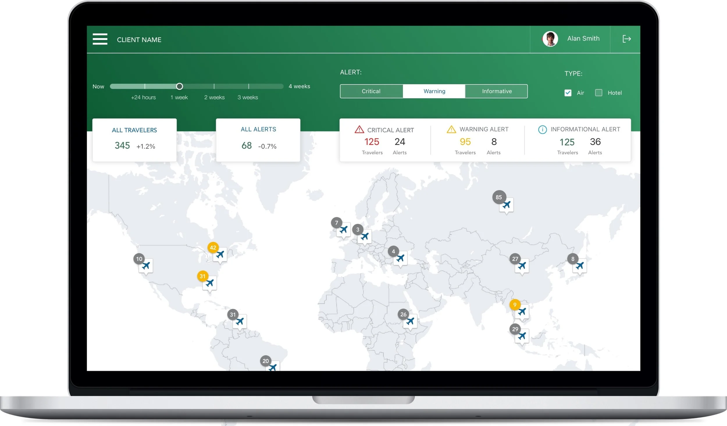
A travel agency wanted to re-design security management dashboards to have a more modern solution and experience with improved usage and design. There were two possible approaches, upgrade to a newer dashboard platform or create a custom solution.
ABOUT PROJECT
Build a single, interactive dashboard based on complex and critical data. This was a client requirement to avoid having to scroll or view multiple dashboards. They preferred to have everything in one dashboard and see all analytics at a glance. We had only 2 weeks to impress the client with a clickable prototype or lose the opportunity.
THE CHALLENGE
PROCESS
Understand and learn from current pain points
As a first step, I went through the product vision ideation, deep dived into current dashboards, explored use cases, and discussed pain points with the current solution’s owner.
This showed that the data was available, but the user experience was missing. This meant it would be best to start from scratch. The goal was to build a simple and fresh solution that maintained the existing logical data models (to simplify the technical perspective).
Maps research, metrics definition
The product owner and I prioritized several requirements which were necessary for end users, such as a location search at the region level, multiple overlays for Country Risk Rating, outline flights en-route and active travelers, and displaying passenger contact details.
Based on these requirements, it became clear that a geochart will best suit the solution. I explored how to visualize the data so that it could work properly with a geochart. This proved to be a complicated problem because there were several metrics and I was limited to our platform’s map base.
I created a systematic list to make sure each metric was understood properly. Some metrics needed to be clarified as they were confusing for end users, such as “This week/ next week”. I performed interviews to check the perception and understanding of the proposed solutions which ensured the metrics usage was clear. The same had to be done for other metrics which were also not clear to end users.
Ideate the solution
The project direction was influenced by the financial aspect. I had to prepare two designs. The first solution used the same analytical product. However, this had several limitations as the platform was limited by layout, visualization and UI design. We did a few iterations over this solution with the client and agreed that this is not something which they would fully benefit from.
Another solution was built in parallel. The second prototype was based on the assumption that it will be a custom built solution. The solution centered around a map where all interactions were focused by using elements such as checkboxes, switches, and zooming. After several iterations with the client, I was able to build a clickable prototype which was the winning solution. After presenting it to upper management, it was agreed to proceed with this approach.
Overall, this project was a success. We designed a new solution within the tight deadline. Because the new dashboards were more focused and user centric, the client saw an uptick of end users while maintaining the existing user base. Furthermore, there was more frequent usage.
The custom dashboards brought more visibility for the secure management team and people were very impressed with its analytical capabilities. The possibility to stay on one page, see where the travelers were, and understand what threatening situations they were exposed to was perceived as extraordinary.


